
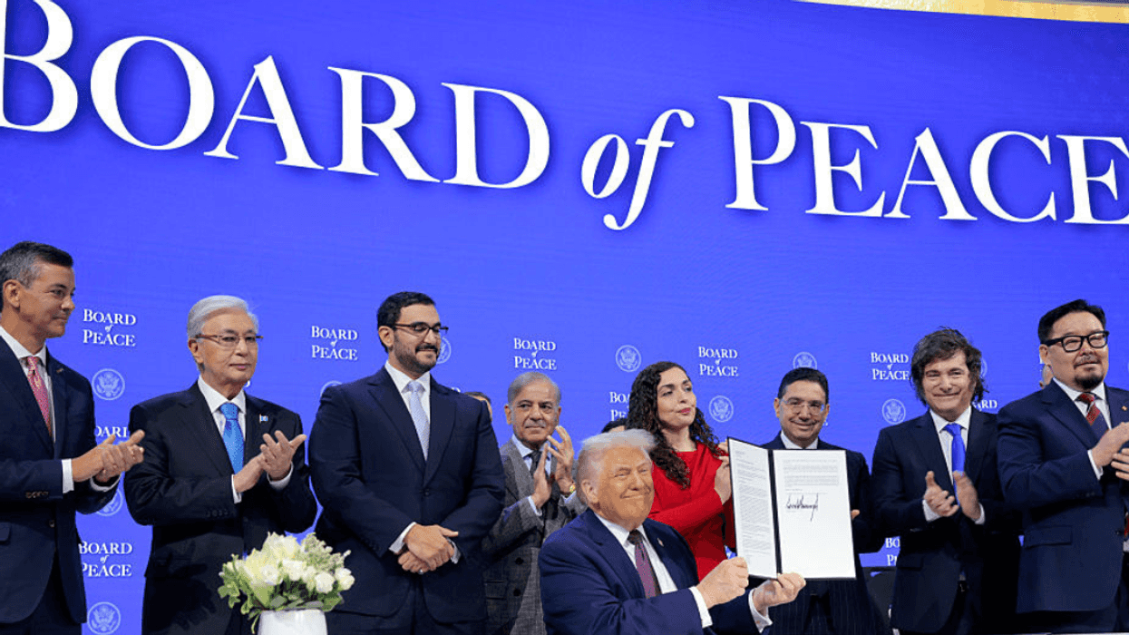

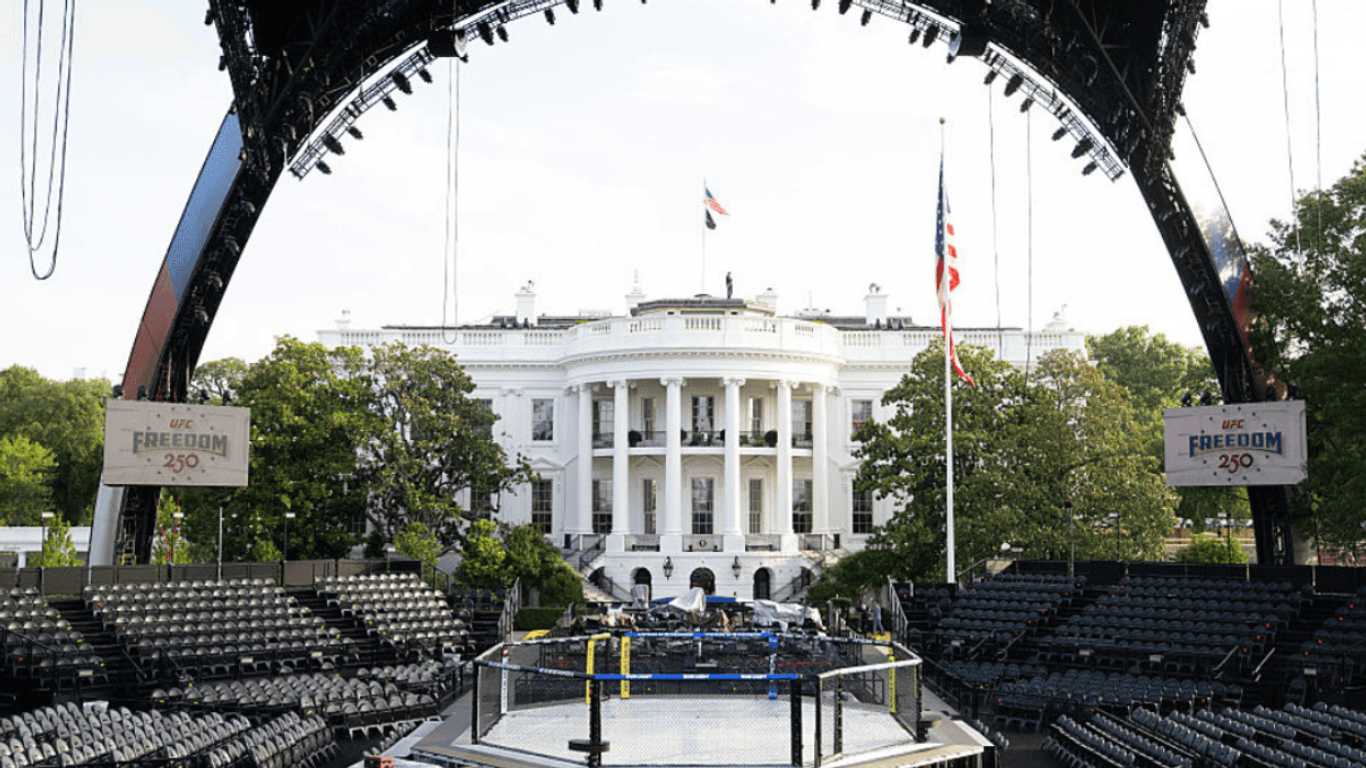
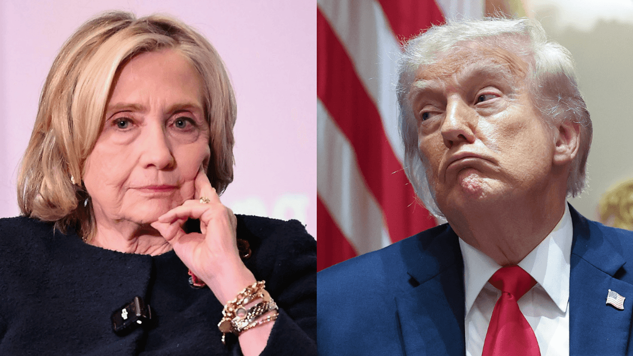
President Donald Trump was widely mocked after unveiling his new "Board of Peace" at the World Economic Forum in Davos, Switzerland, on Thursday—and a logo that bears a striking resemblance to the current United Nations logo.
Trump initially floated the idea of a Board of Peace as a body meant to manage the next stage of his proposed peace plan for Gaza, but the concept has since expanded far beyond that original scope.
The board’s current charter no longer explicitly references Gaza at all. Instead, it outlines a sweeping mandate for a new international organization tasked with “promot[ing] stability, restor[ing] dependable and lawful governance, and secur[ing] enduring peace” in regions affected by or at risk of conflict.
Under the charter, Trump would serve as chair of the board and could be removed only through voluntary resignation or incapacity, as determined by a unanimous vote of the executive board. Member states would generally be limited to terms of no more than three years, though the document carves out exceptions for countries that contribute more than $1 billion.
Most allies opted to skip the charter signing altogether; Trump was nonetheless joined by leaders and representatives from Argentina, Turkey, Hungary, Bulgaria, Bahrain, Kazakhstan, Kosovo, Qatar, Armenia, Azerbaijan, Morocco, Paraguay, and Pakistan.
So far, Albania, Argentina, Armenia, Azerbaijan, Bahrain, Belarus, Bulgaria, Egypt, Hungary, Indonesia, Israel, Jordan, Kazakhstan, Kosovo, Kuwait, Mongolia, Morocco, Pakistan, Paraguay, Qatar, Saudi Arabia, Turkey, the United Arab Emirates, Uzbekistan, and Vietnam have joined the newly-created organization.
Naturally, a new organization merits a new logo—and this is what the Board of Peace released.
![]() Board of Peace
Board of Peace
They say imitation is the sincerest form of flattery: the logo echoes the UN emblem, with both featuring a globe framed by olive branches.
But while the UN logo depicts the entire world, Trump’s version highlights only North America and parts of South America, including Venezuela, a country his administration recently invaded.
The color scheme also sets them apart: the UN’s muted blue is replaced by a shiny gold, a look that aligns with Trump’s personal aesthetic and the gilded decorative changes he has made to the White House.
![]() United Nations
United Nations
No one is impressed.
Between a terrible logo and more weird bruises on his hands, we're really surprised that anyone is taking anything that Trump comes up with seriously.

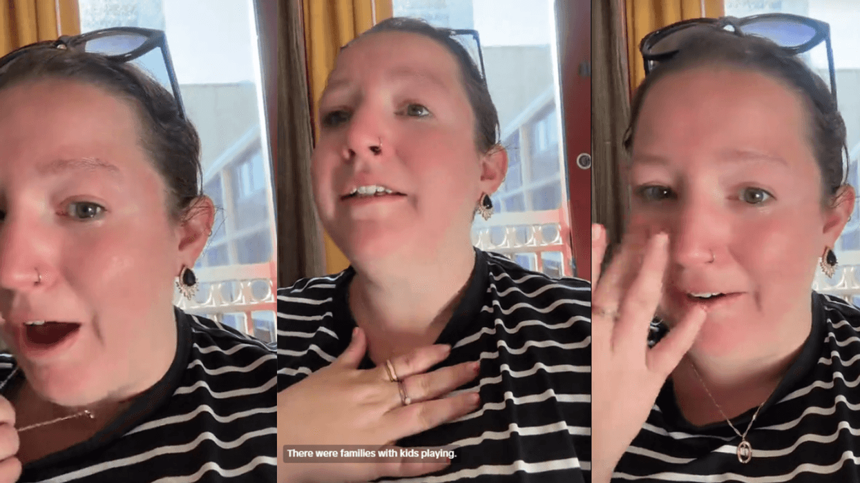
 @guptasarina/TikTok
 @guptasarina/TikTok
 @guptasarina/TikTok
 @guptasarina/TikTok
 @guptasarina/TikTok
 @guptasarina/TikTok
 @guptasarina/TikTok
 @guptasarina/TikTok
 @guptasarina/TikTok
 @guptasarina/TikTok


 @jessicajeankava/TikTok
 @jessicajeankava/TikTok
 @jessicajeankava/TikTok
 @jessicajeankava/TikTok
 @jessicajeankava/TikTok
 @jessicajeankava/TikTok
 @jessicajeankava/TikTok
 @jessicajeankava/TikTok
 @jessicajeankava/TikTok
 @jessicajeankava/TikTok