
The Mercator Map Has Distorted Our Reality for Centuries.
The map below shows how we are used to looking at and thinking about the world. Look familiar?
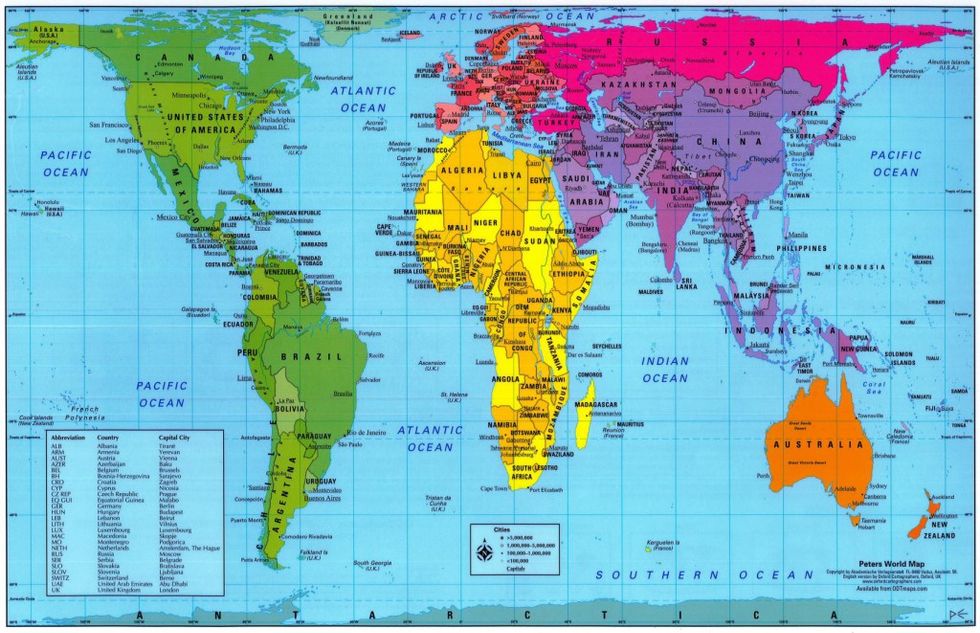
This is called the Mercator Projection, named after the Flemish geographer and cartographer Gerardus Mercator, who developed it in 1569 and inadvertently distorted our world view for the next 446 years. Although we’ve begun to dispel the misconceptions some notable distortions remain, as the good folks on The West Wing explained in their “Cartographers for Social Equality" episode. The Mercator Projection, which many still believe to be accurate, skews the relative size of land masses close to the poles to accommodate the longitude and latitude grid.
But who cares? It turns out, size matters--and so does placement. This is why Greenland looks so damned important on the Mercator Projection and why the US is so often smack in the center—our sense of worth is so aggrandized that we often split Asia in half to place ourselves front and center.
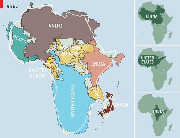
“The Greenland Effect” is only one of many issues with the Mercator Projection. For example, even though Greenland and Africa appear to be roughly the same size on this map, Africa is 14 times larger. The continent's true size encompasses not only Greenland but China, the United States, India, and Western Europe put together, as The Economist’s graphic shows:
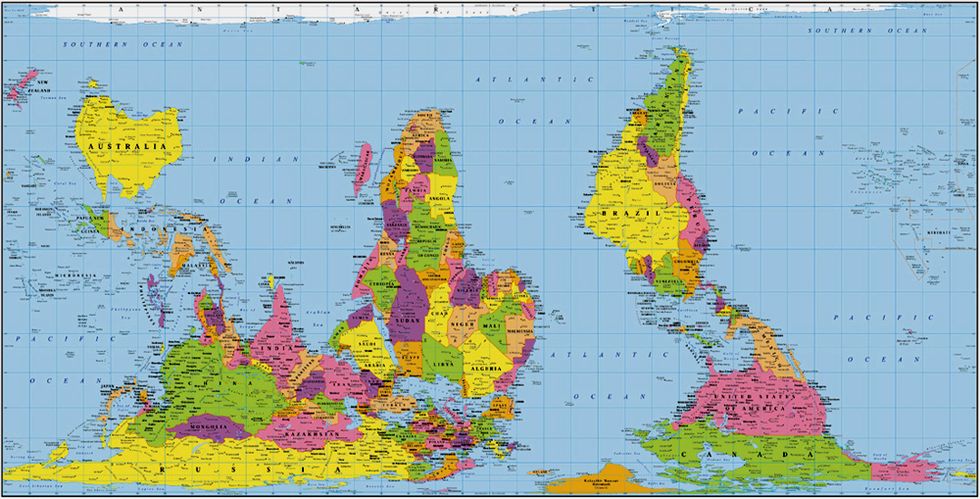
If you would like a more accurate representation of the world and the relative sizes of countries and continents, look at the Gall-Peters map where areas of equal size on the globe are equally sized.
And if you really want to see how Northerners have conveniently skewed the world to suit their ends, try turning the map upside down.
This is perfectly legitimate—we’re a big spinning ball in space, and North and South are really just reference points. Or are they? Think what the world might be and look like if the aboriginal people of Australia or the Incas had beaten us to mapping it.
Antarctica: The Land Without Time
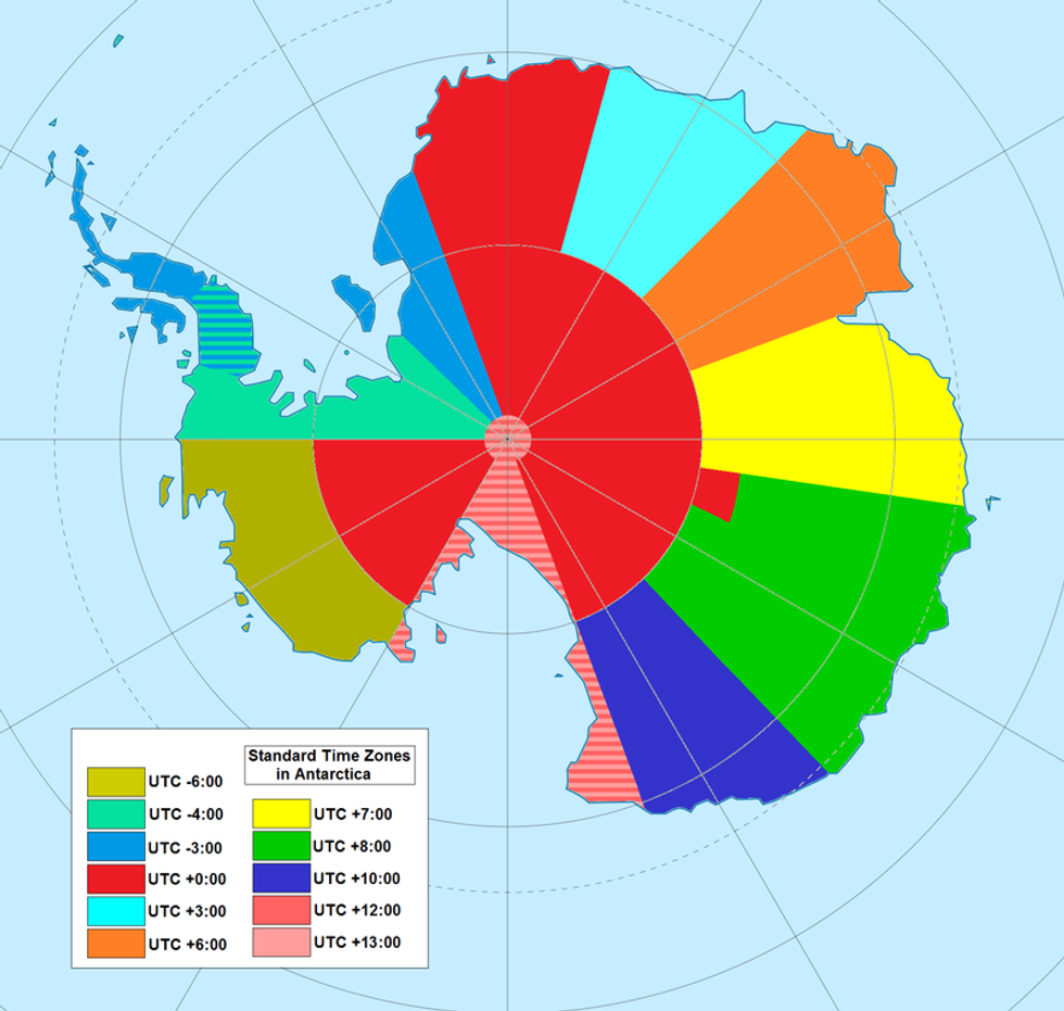 UTC hue4map ATA/Wikimedia Commons.
In almost all places on our planet, local time is determined by lines of longitude, so that the time of day reflects the sun’s position over Earth. This logic crumbles at the South Pole, however, where the lines of longitude converge, so technically all time zones exist at the South Pole. Here’s a breakdown of Antarctica’s timezones:
So why not disregard the lines of longitude and use the sun to estimate the time instead? According to National Geographic, “The sun rises and sets only twice every 12 months here,” meaning that the South Pole experiences up to 24 hours of sunlight in the summer and 24 hours of darkness in the winter. Neither option solves this paradox. Instead, research stations use the timezone of either their home country or that of their supply base. For instance, the United States’ McMurdo Station operates on New Zealand time, because its supplies come from Christchurch, New Zealand (yes, that Christchurch). This does simplify communication with its home base and suppliers, but the choice is nonetheless arbitrary.
Not only does the South Pole lack a true singular timezone, it is also a land without ownership. The Antarctic Treaty, passed in 1961, safeguards the continent as a scientific reserve, banning military activity or weapon testing on the continent. Article 3 of the treaty establishes that no sovereignty may establish territorial claims to Antarctica, so technically the frozen tundra belongs to the advancement of science alone.
By contrast, ownership of the North Pole is a matter of dangerous competing claims by Russia (which even sent a submarine beneath the ice and planted a flag in the seabed), Canada, the United States, and other nations, not only because the catastrophic melting of the ice caps have opened new waterways for transport, but because huge natural gas and oil reserves may lie beneath.
Swiss Children Will Be The Happiest in the World By 2030
In 2013, The Economist’s sister company, The Economist Intelligence Unit (EIU), ranked the best places to be born, and “measure[d] which country will provide the best opportunities for a healthy, safe and prosperous life in the years ahead.” While they used life-satisfaction surveys to determine “how happy” citizens were, they also relied on more objective data like geography, climate and economy to generate the following rankings on each country’s quality of life:
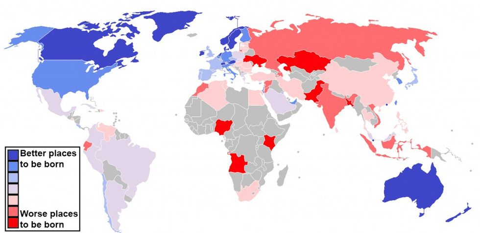
The EIU’s survey forecasts what life will be like when the children born throughout the world in 2013 will be approaching adulthood in 2030. The EIU ranked Switzerland in the premiere spot in their “Lottery of Life,” proving that life satisfaction can be quantifiable. Out of 10 possible points, much like the Olympics country ranking system, Switzerland scored 8.22, with Australia as a close runner-up at 8.12.
It’s no surprise that Switzerland comes in first, once you review some of their laws. Truly embracing Sunday as the day of rest, the Swiss not only consider it indecent but illegal to mow one’s lawn, hang one’s laundry or recycle bottles, all so citizens don't disturb their neighbors. It is also illegal to flush goldfish down the toilet on any day of the week. All jokes aside, what lessons can we learn from their culture to improve the lives of the next generation?
Nordic countries fill out the top spots in the EIU survey: Norway (8.09), Sweden (8.02), and Denmark (8.01). Germany and the U.S. are tied for 16th place with 7.38 points. Due to the current economic climate, countries like the U.S. will fall behind because the next generation will inherit its debts, which are close to $18 trillion. Similarly, many struggling nations in the Euro zone (Greece, Portugal, and Spain) trail the more stable Nordic countries. Among the 80 countries ranked, Nigeria comes in last as the worst place for a baby to have entered the world in 2013.
Nearly Half of the United States of America is Uninhabited.
This map, created by Nick Freeman, fills in the blanks about where people actually live in the United States. "Human geographers spend so much time thinking about where people are," Freeman writes. "I thought I might bring some new insight by showing where they are not."
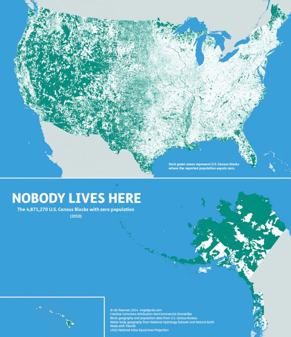
The dark green area represents U.S. census blocks where the reported population equals zero, meaning no one calls it home. Out of the 11,078,300 “U.S. Census Blocks,” an astonishing 4.8+ million blocks have no population to them, meaning there are 4.61 million square unoccupied kilometers in the U.S (or 1.78 million square miles). Although the population of the U.S. exceeds 310 million people, 47% of the country remains unoccupied. Some of these areas are simply uninhabitable (i.e., lakes, rivers, deserts or land where settlement is prohibited). But others are just empty because, well, apparently nobody wants to live there.
A critical question arises, however, when we calculate the relative electoral power of some of these sparsely inhabited states. According to Slate.com’s Chris Kirk, “The average electoral vote represents 436,000 people, but that number rises and falls per state depending on that state’s population over 18 years of age.” The power of a state’s electoral vote skews higher if it has decreased population, meaning that votes cast in North Dakota, Vermont, and Wyoming’s hold more power than in other states with larger numbers of voting residents. Wyoming far undercut the benchmark of 436,000 residents per electoral vote with a population of just 143,000 people in the 2012 election but an electoral count of three, especially in comparison to states like New York which has approximately 500,000 citizens per electoral vote. Kirk writes, “In other words, one Wyoming voter has roughly the same vote power as four New York voters.” Voters in these smaller states thus hold greater influence when it comes to determining the outcome of an election.
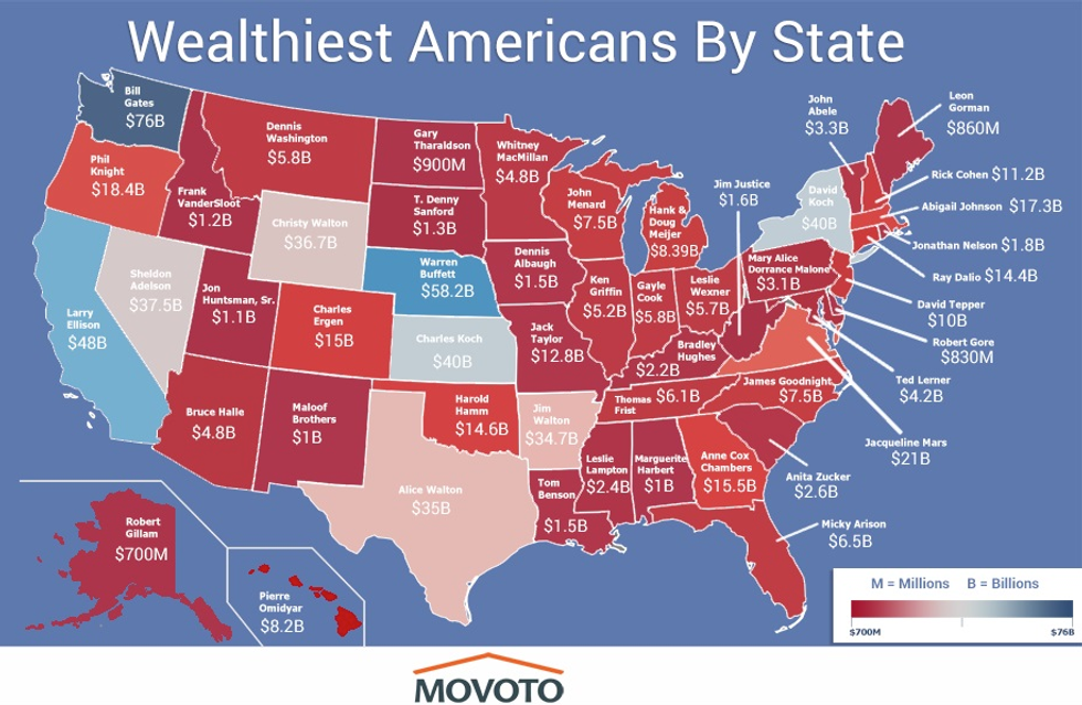
Show me the Money
We have an odd fascination with the very wealthy. But who are they, and where do they live?
 Movoto
There are approximately 450 billionaires in the U.S. (according to Movoto), and while nearly half of them live in New York or California, there’s almost one in every state. According to Forbes and Celebrity Net Worth, these billionaires amassed their wealth in various ways, from entrepreneurs to heirs to widows. For instance, the heirs to the Wal-Mart fortune (Jim, Alice, and Christy Walton) each top their individual state’s list, with roughly over $35 billion each, thanks to their father, Sam Walton. Some of these billionaires are household names like Bill Gates ($80 billion, Washington) or Warren Buffett ($63.1 billion, Nebraska). While a college degree usually plays a part in their fortunes, Bill Gates actually was a college dropout.
This skew of income affects politics significantly. In the presidential campaign of 2012, 32 high net worth individuals contributed to their favored political parties and, according to Senator Elizabeth Warren (whose office studied this issue extensively), the amount contributed by these 32 exceeded the combined donations of 3.7 million average Americans. This effectively meant that 32 people had more influence and access than 3.7 million. Commenting on this imbalance, Senator Warren warned simply, “When 32 people can outspend 3.7 million citizens, our democracy is in real danger.”
Many constitutional scholars and pundits believe the imbalance of influence (especially after the Supreme Court’s Citizens United decision lifting campaign contribution limits) poses the single biggest existential threat to our democratic institutions.
If the World’s Population Lived like Manhattanites, We Could All Fit in Texas.
We may want to change the old adage “packed in like sardines” to "packed in like New Yorkers." According to Per Square Mile’s infographic, created by Tim de Chant, if the world’s 6.9 billion population lived as close to each other as Manhattanites, we could all fit into Texas. Paris’s population density had even a more tightly packed footprint:
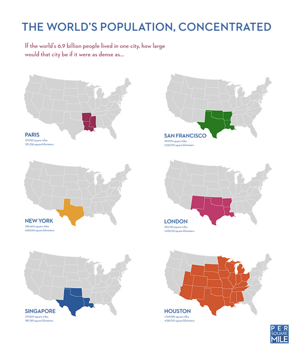
This is mainly because we have more land than we do people; however, de Chant notes one often-overlooked consideration: “Cities’ land requirements far outstrip their immediate physical footprints. They include everything from farmland to transportation networks to forests and open space that recharge fresh water sources like rivers and aquifers.”
Even if we could all fit into Texas, we would still require much more land outside the state to support ourselves. In fact, we would require four planets the size of Earth to support the population, were the world to use as much land as America does to support its urban areas.


 @JennJVN/X
 @HunterBiden/X
 @HunterBiden/X