
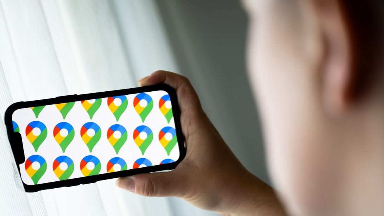

After years and years of its standard look, rumor has it that Google is updating the logos of some of its key services, including Google Photos and Google Maps.
According to rumors online, Google is switching up the color-blocking look it's been known for in favor of new color gradient looks where the brand's colors blend into one another.
But when it comes to the new Google Maps logo, the gradient isn't the only change coming, apparently.
The logo's little map pin design is getting a much wider hole for some reason. And, well... you can just imagine what the gays have done with this news!
The logos' redesigns are part of Google's rebrand for the age of AI. In a statement in September, they explained:
“While staying true to Google’s iconic four colors, the brighter hues and gradient design symbolize the surge of AI-driven innovation and creative energy across our products and technology.”
But the color change was the least of people's concerns on social media.
In fact, the gradient seemed to go entirely unnoticed. It was the wider hole in the Maps pin that most caught LGBTQ+ people's notice, because of... well...
Sometimes when you have a lot, or maybe even a bit too much, fun in the backdoor? Things, you know... take a bit of time to retract back to its usual size, ifyaknowwhatwemean.
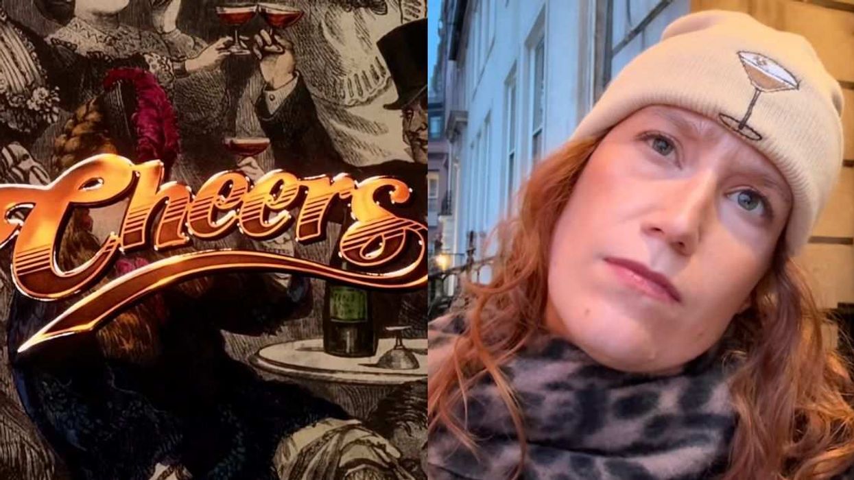
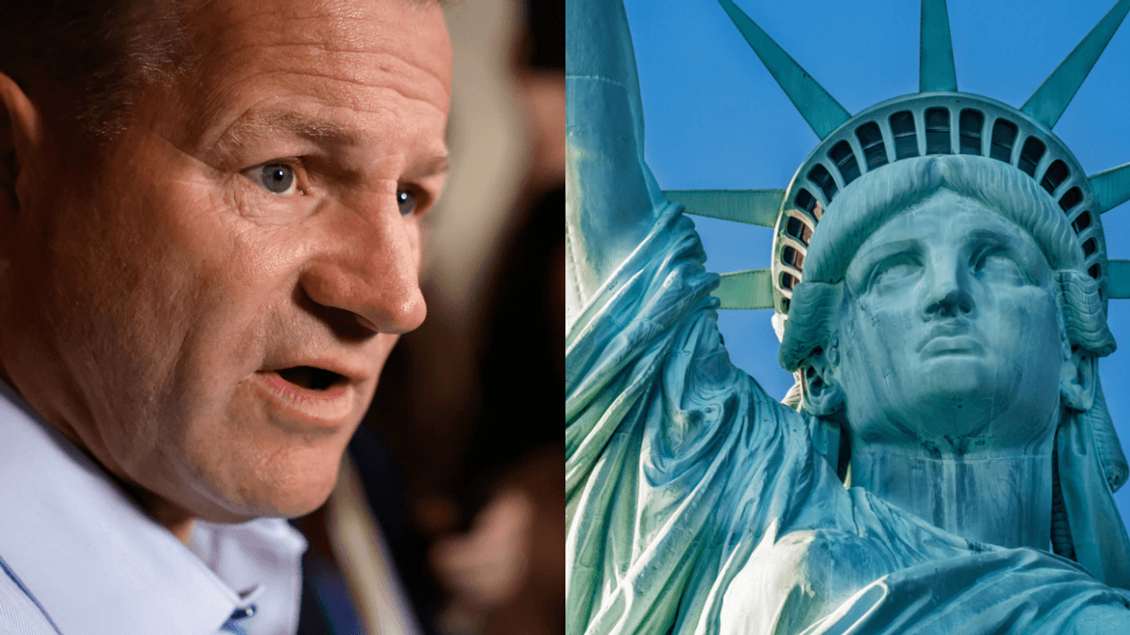
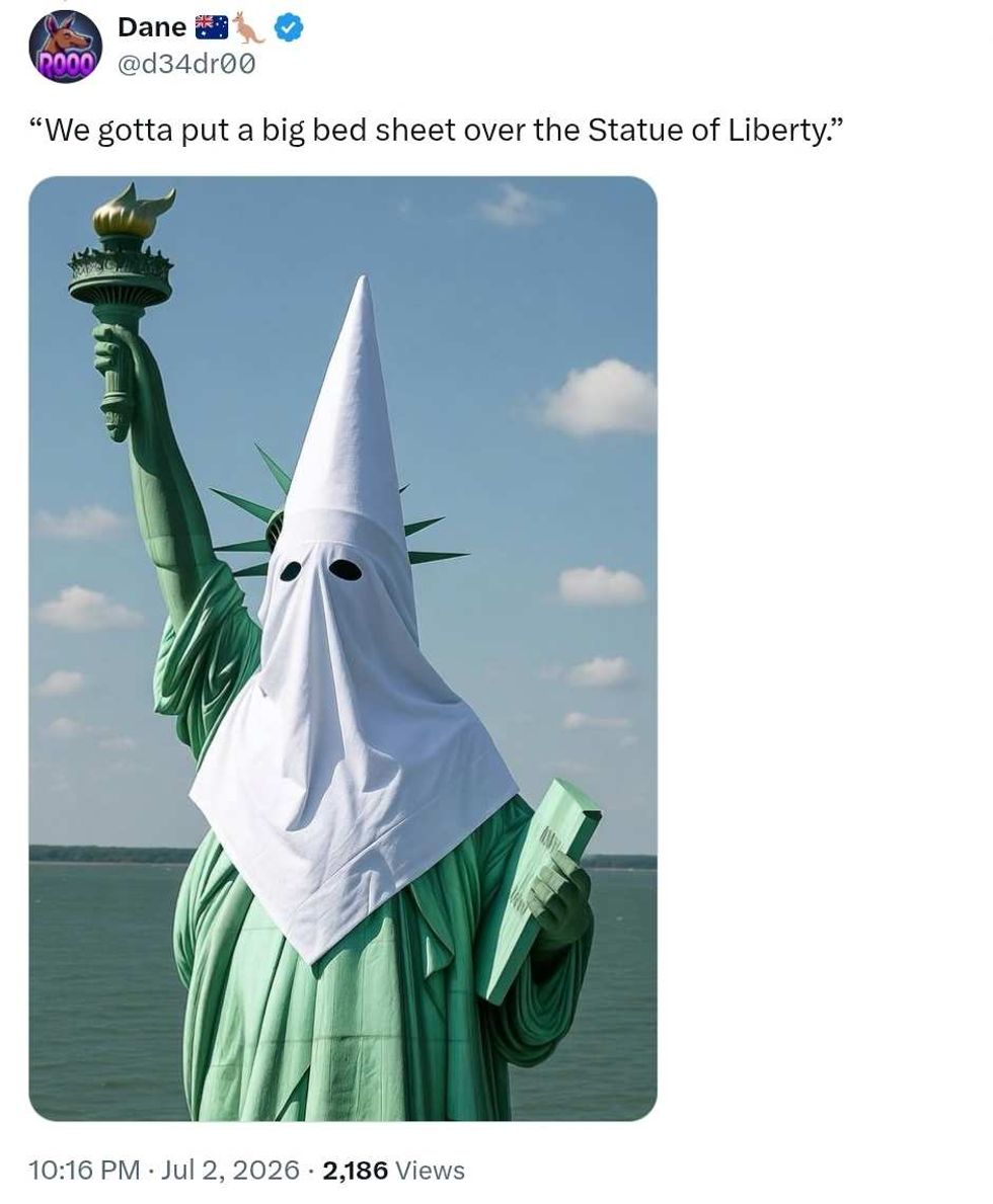
And markedly wider, uh, hole in the Maps logo had many online unable to resist turning the new logo into a series of NSFW jokes about all manner of sexual goings on!
One even managed to incorporate both the legendarily horrifying "Goatse" meme from 20 years ago with a reference to one of the more outre backdoor activities, all in one post.
The internet gays are nothing if not thorough! Even hook-up app Grindr got in on the fun with a joke about recognizing the gape in question.
And before long a new meme rife with innuendo was born.
And as always, some people missed the joke and immediately took offense, accusing gay men of misogynistically mocking women with their response to the new logo.
The context of the tweets in question makes it very obvious this was gay men mocking other gay men, but whatever.
Anyway! The new logos with the color gradient started with the Google Search logo back in May.
The company explained:
“The new ‘Google G’ now represents all of Google — both our brand and the company — and visually reflects our evolution in the AI era."
The changes have since gradually filtered down through Google's other products, especially its Gemini AI services.
It's not known yet when the new Photos and Maps logos will go into effect—or whether the Google design team will be doing some revisions to that Maps gape before going live, given the online response.


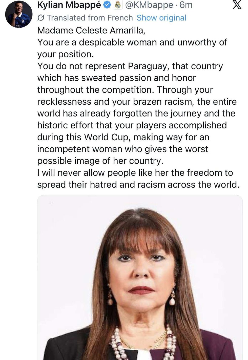 @kmbappe/X
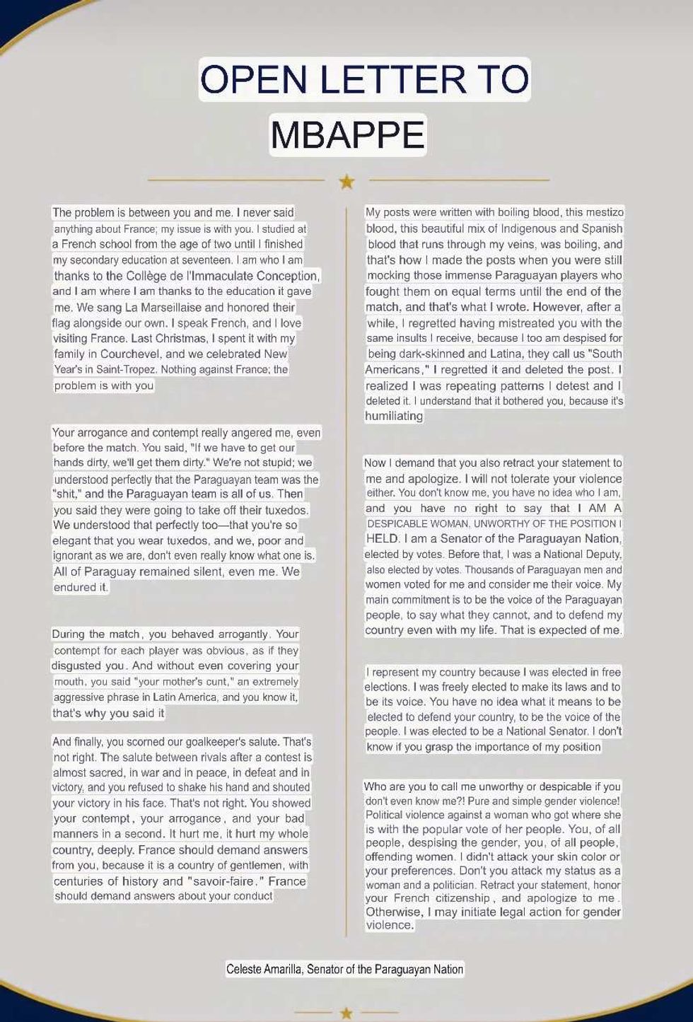 @MadridXtra/X

 @d34dr00/X
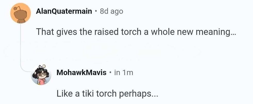 r/WhitePeopleTwitter/Reddit
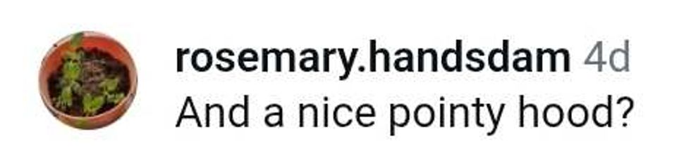 @rosemary.handsdam/Instagram
 r/WhitePeopleTwitter/Reddit
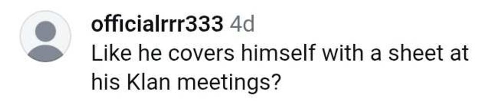 officialrrr333/Instagram
 r/WhitePeopleTwitter/Reddit
 r/WhitePeopleTwitter/Reddit

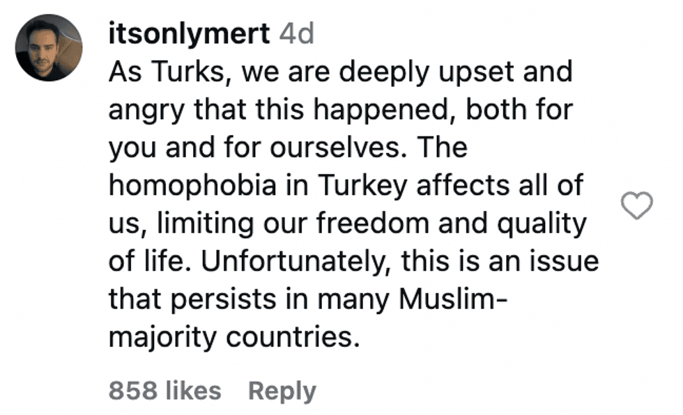 @itsonlymert/Instagram
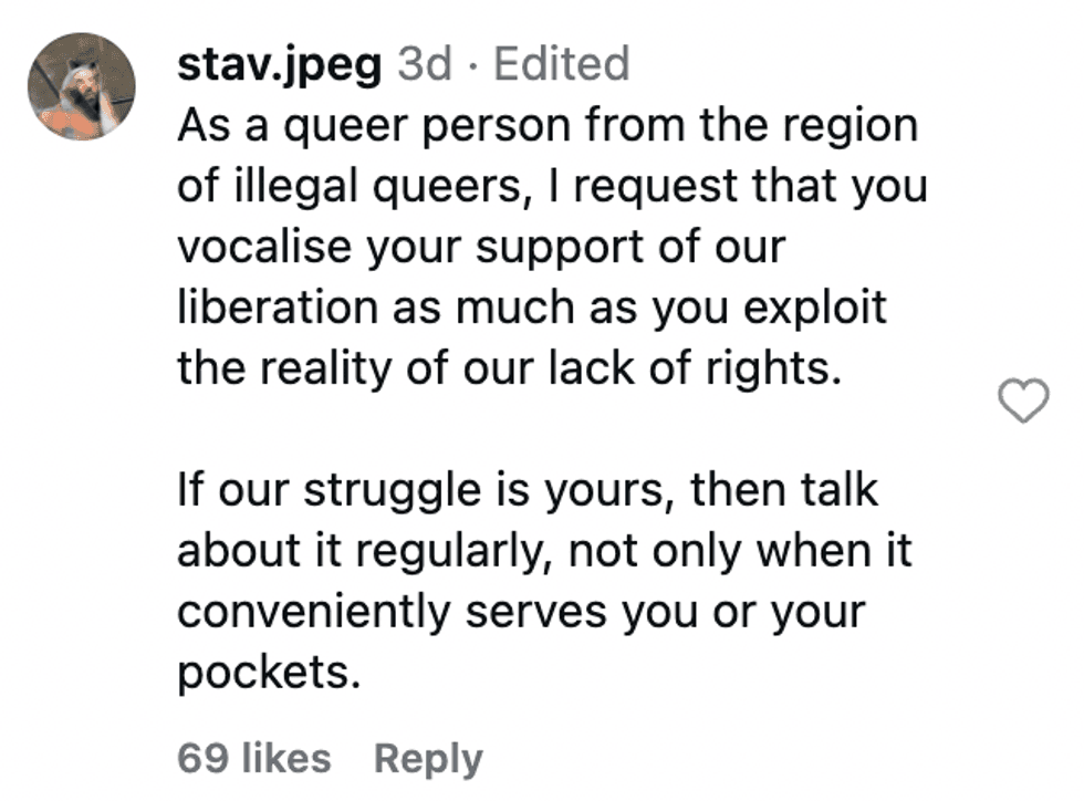 @stav.jpeg/Instagram
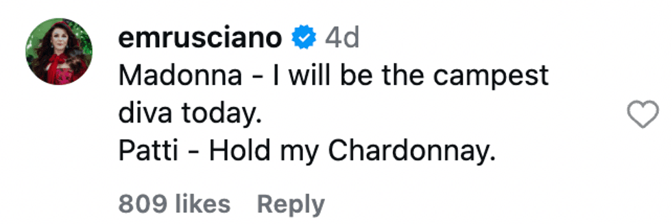 @emrusciano/Instagram
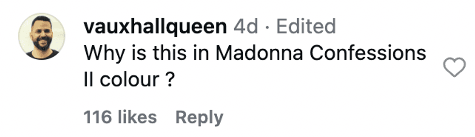 @vauxhallqueen/Instagram
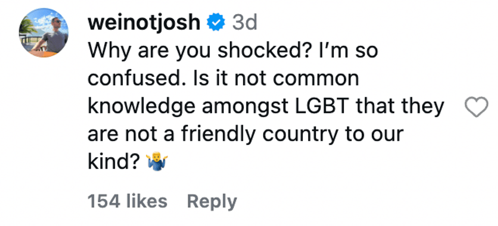 @weinotjosh/Instagram
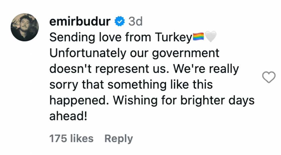 @emirbudur/Instagram
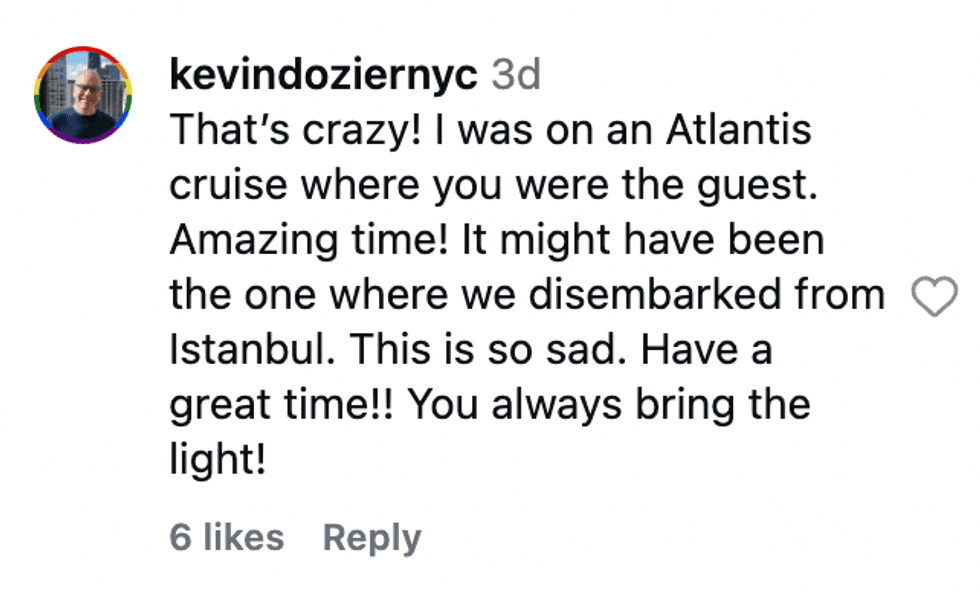 @kevindoziernyc/Instagram
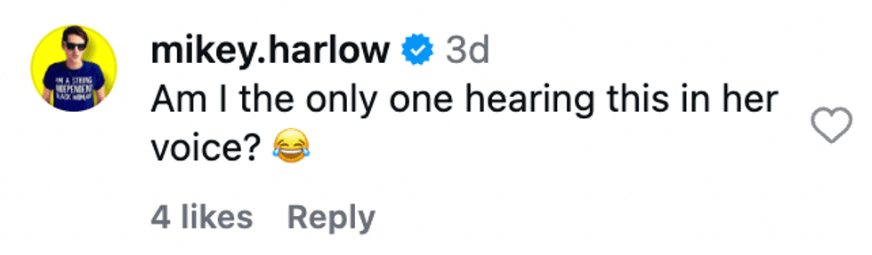 @mikey.harlow/Instagram
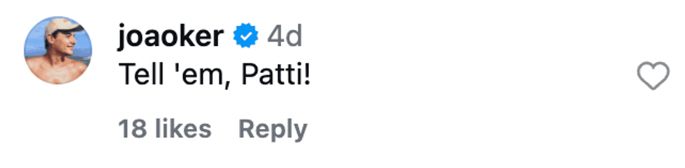 @joaoker/Instagram
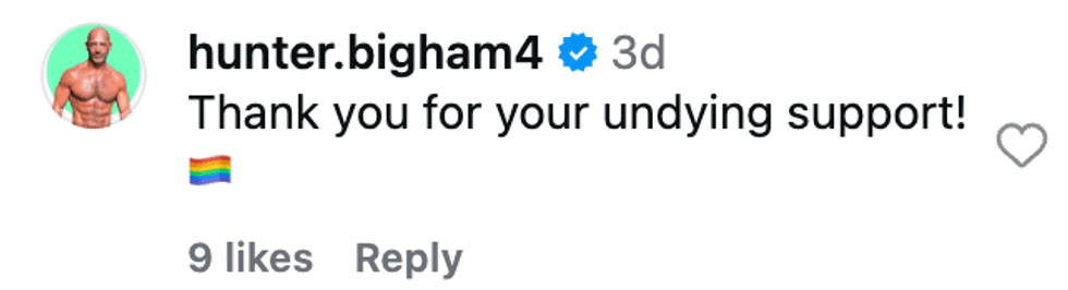 @hunter.bigham4/Instagram
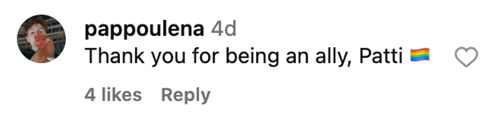 @pappoulena/Instagram
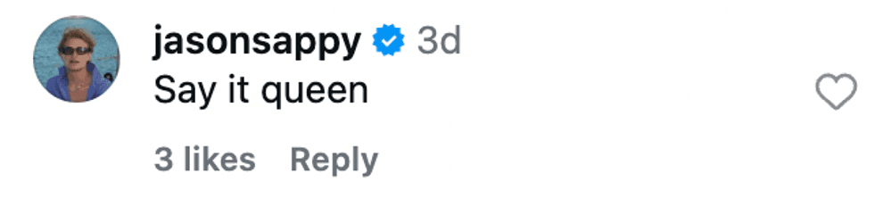 @jasonsappy/Instagram