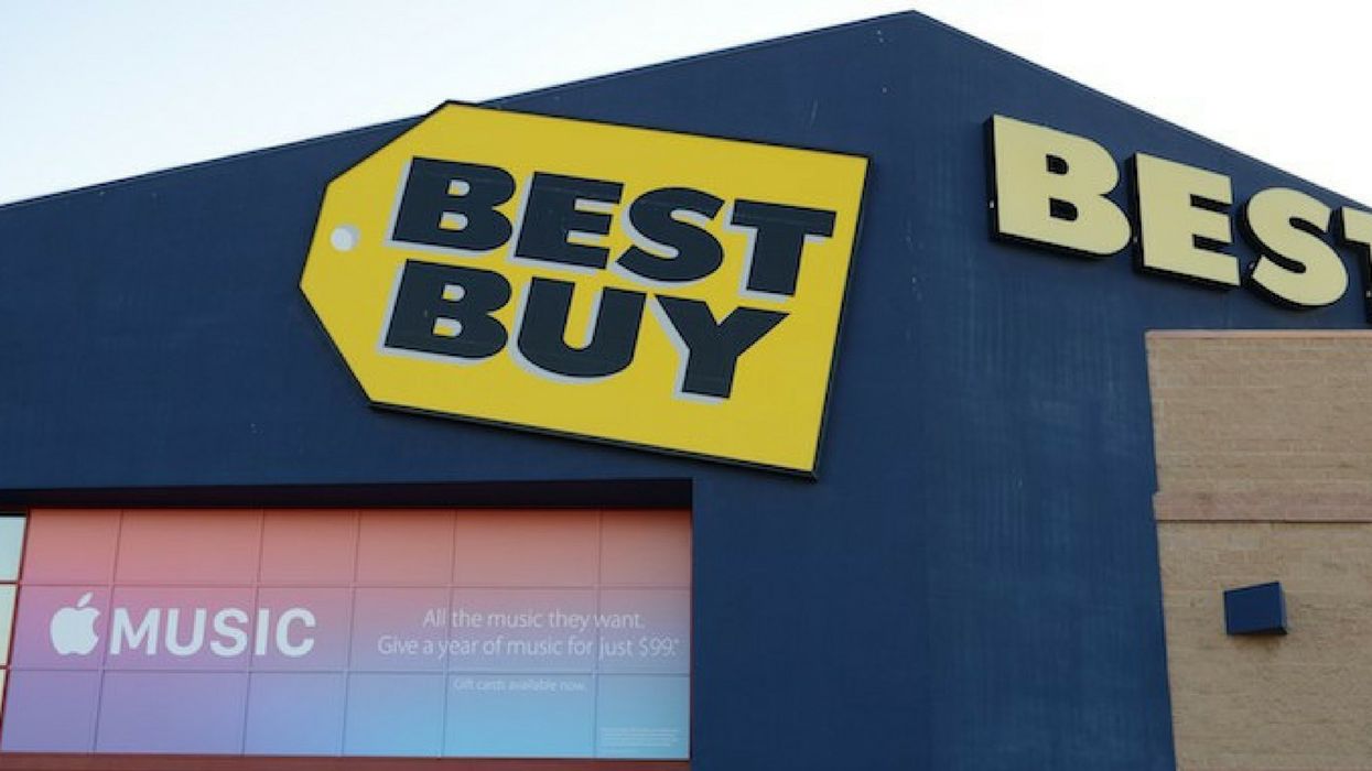
With brick and mortar establishments forced to close up shop due to an increase in online shopping, one retail giant remains tenacious and even changed their logo.
Best Buy introduced a new, streamlined logo in tandem with evolving business strategies. But will those changes keep the retail chain safe from the off-switch for a few more years?
Time will tell. But for now, initial reactions to the store's new logo weren't particularly favorable. Some just weren't buying it.
.@BestBuy launches refreshed branding, logo. Learn more: https://t.co/eznI5j5KvO https://t.co/Ygv7qeeZu3— Best Buy News (@Best Buy News) 1525869328.0
@healthynaff I’m bothered at the thought someone likely made a lot of money for that design and I’m over here slaving it away.— Liquid (@Liquid) 1525975923.0
The new design sports an easier-to-read white font against a blue background instead of the former black lettering within the shape of a yellow price tag.
What was the thought process behind the graphic change?
@BBYNews @BestBuy https://t.co/HHgWnpP1bU— New Jack City (@New Jack City) 1525889476.0
The logo change is part of the company's re-branding strategy that launched on May 9.
Best Buy staff writer John Vomhof Jr. described the upcoming growth initiative, including their expanding merchandise offerings and the evolving ways of selling them.
The creative elements of the refreshed branding include an updated Best Buy logo and a new look and feel with updated colors, photography and conversational language. It's all designed to highlight our culture, our expertise and our talented employees.
Some consumers were okay with the design.
New branding and logo for BBY. Thoughts? Its clean, modern, still stays true to its roots. The messaging is strong.… https://t.co/GmDV8MJzmq— Beth Naffziger (@Beth Naffziger) 1525885742.0
If it ain't broke, don't fix it.
Not a big fan of this logo, specifically the font. I think it should be thinner or thin with a shade of bold in it.… https://t.co/ikmg8AjRUe— David Becker (@David Becker) 1525919115.0
Criticism about the new logo's familiarity began brewing.
.@BestBuy kills its iconic logo . . . and embraces light beer? https://t.co/m5h7c8vsJo https://t.co/EUqqKUPbFB— Co.Design (@Co.Design) 1525921746.0
Best Buy debuted a new logo yesterday. https://t.co/VlOLIjFU4L— George Slefo (@George Slefo) 1525953505.0
@FastCoDesign @BestBuy Reminds me of fortnite https://t.co/gUgQjp6BWZ— Blackjak Squarepants (@Blackjak Squarepants) 1525973035.0
@GeorgeSlefo Its 2 completely different fonts— Backpack-Frontpack (@Backpack-Frontpack) 1525976404.0
The new @BestBuy logo sort of looks like a cross between the logos for Finding Dory and Bud Light. https://t.co/vDs3cyC1dC— Aaron Bearden (@Aaron Bearden) 1525877602.0
@mclaaron @BestBuy Finding Bud Light— Burst (@Burst) 1525978578.0
If customers could contribute ideas, the logo might look something like this:
@BBYNews @BestBuy I'm gonna put my hat in the ring here.... https://t.co/I8fxm1kIF5— Armik (@Armik) 1525885360.0
Could this prognosticate the retailer's future?
@healthynaff Best Buys next logo https://t.co/7250mVz21m— Kevin Borregaard (@Kevin Borregaard) 1525980827.0