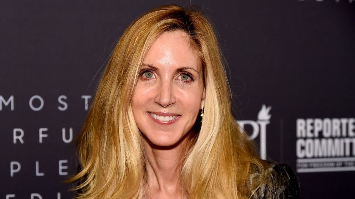
Ann Coulter isn't generally known for her nuanced opinions.
Most people know her as the woman who occasionally yells at President Donald Trump on Twitter between making offensive comments.
But a new chart she posted to Twitter seemed to take things to a new level of ignorance not even the internet could believe.
In her tweet, Coulter claimed that new data revealed the recent pandemic is less deadly than the season flu for people under 60.
But Twitter was quick to point out, however, that the data she posted revealed the exact opposite.
Many who were more mathematically inclined than Coulter also pointed out how poorly the graph was set up.
At this point, Coulter's words are confusing at best and dangerous at worst.
Coulter's chart was also specifically focused on a country with a far better testing program than the U.S.
After everything she's said, sometimes it's hard to believe Ann Coulter is real.
Twitter wasted no time in turning her misinterpretation into a mocking meme.
Whether or not she used actual facts, President Trump surely appreciated Coulter's analysis.
Perhaps Ann Coulter should take some time off Twitter to get a refresher on her basic math skills.
It would be helpful for all of us.






 @mohu/Threads
 @mohu/Threads
 @mohu/Threads
 @mohu/Threads
 @mohu/Threads
 @mohu/Threads
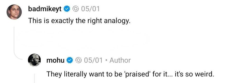 reply to @mohu/Threads
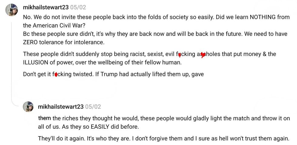 reply to @mohu/Threads
 reply to @mohu/Threads
 reply to @mohu/Threads
 reply to @mohu/Threads
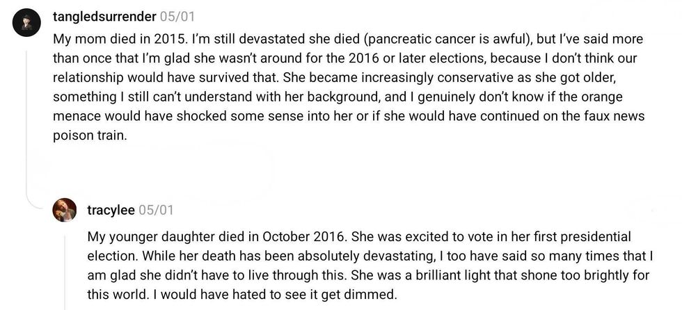 reply to @mohu/Threads
 reply to @mohu/Threads
 reply to @mohu/Threads
 reply to @mohu/Threads
 reply to @mohu/Threads
 reply to @mohu/Threads
 reply to @mohu/Threads
 reply to @mohu/Threads
 reply to @mohu/Threads
 reply to @mohu/Threads
 reply to @mohu/Threads
 reply to @mohu/Threads
 reply to @mohu/Threads
 reply to @mohu/Threads
 reply to @mohu/Threads
 reply to @mohu/Threads
 reply to @mohu/Threads
 reply to @mohu/Threads
 reply to @mohu/Threads
 reply to @mohu/Threads
 reply to @mohu/Threads
 reply to @mohu/Threads
 reply to @mohu/Threads
 reply to @mohu/Threads
 reply to @mohu/Threads
 reply to @mohu/Threads
 reply to @mohu/Threads
 reply to @mohu/Threads
 reply to @mohu/Threads
 reply to @mohu/Threads



 @realDonaldTrump/Truth Social