
At this point, almost everyone whose job involves communicating online with their co-workers has either used Slack or has at least heard of it. The self-proclaimed "collaboration hub" has a long list of customers including 21st Century Fox, Liberty Mutual Insurance, and HelloFresh. Yesterday, the company unveiled a brand new logo, and people are not feeling it.
In case you're somehow able to keep away from Slack for more than 5 minutes, or you are really bad about updating your apps (yeah, I see you), then you might have missed Slack's new logo.
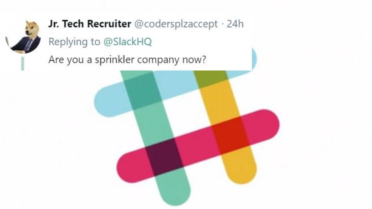
Yesterday afternoon, they revealed their re-imagined logo via Twitter and app update.
The tweet includes a GIF that shows the original, hashtag-style logo, turning into their new logo.
While it's not drastically different than the original, people feel as though it has lost some of its unique appeal.
Others simply don't understand the need for the change.
The company explained their reasoning in a blog post. Long story short, Slack thinks this new logo is simpler and more refined than the old logo.
While I understand their reasoning, I'll never stop missing the OG logo.


 @trew_808/TikTok
 @madisonleanne8/TikTok
 @nanaonakawa/TikTok
 @llamalexa/TikTok
 @hisgirlfriday5/TikTok
 @jblair1118/TikTok
 @jaylauscher/X
 @ChrisPorter22/X