Georgia's Republican governor, Brian Kemp, faced backlash even from President Donald Trump when he made the decision last month to begin easing stay at home orders in the state.
People didn't have much faith in his decision, considering he didn't learn about the prevalence of asymptomatic carriers until weeks after it became public knowledge.
Kemp's office is still trying to minimize the threat posed by the virus in an effort to justify the move to prematurely begin reopening. Now, it looks like they're willing to fudge public data to do so.
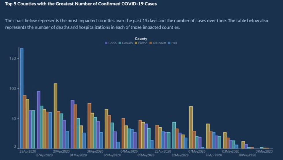
A graph released by the Georgia Department of Public Health documenting virus deaths in five Georgia counties, at first glance, looks promising.
It appears to show a consistently downward trend in deaths and hospitalizations in Cobb, DeKalb, Fulton, Gwinnet, and Hall counties over time.
But take a closer look at the x-axis.
The dates go from April 28 to April 27, then the 29, then May 1 to April 30, followed by May 6, May 4, May 5, all the way back to April 25, then May 2, May 7, April 26, May 3, May 8, and May 9.
In other words, the dates are completely out of order, resulting in a graph that looks more promising than it actually is.
Governor Kemp's communications director Candice Broce offered up a bizarre explanation for the confusing and downright misleading graph.
But all was not forgiven.
They weren't buying Broce's explanation either.
What a mess.


 @TheSilencer345/X
 @5NYCCOM/X
 @JerryNeff11/X
 @WonkaMaga/X
 @WallStreetMav/X
 @BostonSportsHb/X
 @matthewmodine/Instagram